On a whim I tried switching to Monego (a derivative of Apple's Monaco font) in my editor/terminal. I was shocked by how legible it remains at small sizes compared to other fonts I've used.
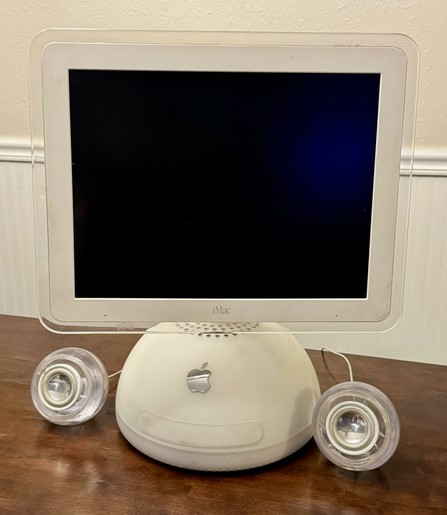
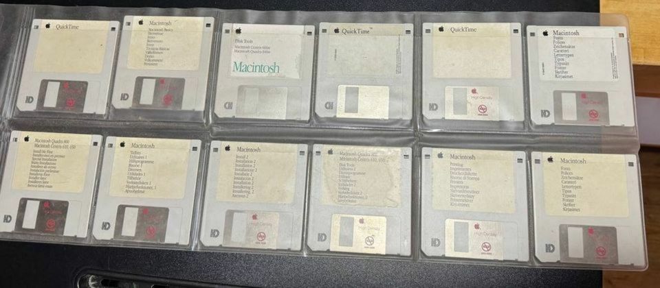
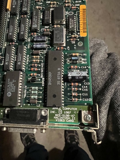
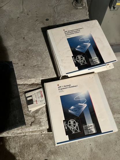
This all makes sense of course seeing as how Monaco dates back to the original Mac. There weren't that many pixels to work with back then. Still, amazed at how many things old-school Apple got so so right.


